2012年10月30日星期二

Holocaust Exhibition Review


The Holocaust Exhibition traces the persecution of Nazi and the murder of Europe’s Jews from 1933 to 1945. The exhibition uses historical material to tell the story of the ruthless massacre.

The exhibition starts with a full wall of old portrait photography and three short videos. From the figures’ eye on those photos, the audiences feel suffering and depressed deeply. Visitors can know the exhibition will be surrounded by heavy atmosphere, which is showed on the exhibition. At the same time, there is a tip board behind the entrance. It is notes that the Holocaust exhibition is recommended for the children, which are aged 14 years old and above. The detail shows the careful consideration by the curator. Because of this kind of theme is not suitable for young children.

After appreciate the photographic, the audience should through a short dark and narrow corridor. Then audience enters the dark display hall. The whole exhibition is in the darkness situation and the lighting effect builds a dignified atmosphere. Time is the exhibition's main sequence and the way of differentiate different area. The story begins with the background of the Nazi party, until how Europe-wide anti-semitism made a fertile seedbed for Hitler's anti-Jewish beliefs. Using the real material object to narrate process is the main methods during the exhibition. Because of the background and the culture about the holocaust are far away from our life, so the visitor cannot imagine the situation at that time. Also these historical materials will provide the fresh images into our sights. Another curating characteristic in the exhibition is the perfect impression combination with photographs, videos and materials. The audience stands in front of a showcase will see the huge photo background, which they can watch the media and the material and listen the voice at the same time. It seems that brings the audience to the same surroundings, like you can experience the same suffering. However, it does not showing the audience the horrible weapon and device in the Holocaust Exhibition. Only display the ordinary commodities, such as toys, photograph albums and clothes. Also rebuild the survival context. The mementos reveal people’s efforts to survive and the painful of existence. Although not used bloody violence pictures, but still make the audience feel miserable.

After visit the whole exhibition, it is easy to know that the media plays a significant role in the exhibition. There are two kinds of video using in the exhibition, one is the true record video at the Second World War, another is testimonies from 18 survivors bring a moving and haunting perspective. The first video makes people see the cruelty about the history; the second one makes the people aware of the hardship of survival. The video has more powerful to show this kind of historic event.

The exhibition of the structure is very interesting. When you walk inside, you will associate the Jewish Museum in Berlin. Both of them used the twists and turn of the winding internal structure to imply that the Jews constant struggle in adversity.

2012年10月28日星期日

An Interactive Cloud


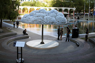
I really believe any interested idea of a designer can be make it out. I found an exhibition named “Cloud” which display at Nuit Blanche Calgary in Alberta, Canada. It is an exciting installation gave me a deep impression even though I just get the information from internet.


Cloud is a large-scale interactive sculpture created from 6,000 light bulbs, new and burnt-out. Constructed by Calgary-based artist Caitlind r.c. Brown and collaborator Wayne Garrett, CLOUD was on public display for one-night-only during Calgary’s first Nuit Blanche Festival.


I have to say Cloud is an amazing design, not only the beautiful cloud shape that you can say it is a white tree yet, but also the flickering bulb controlled by audiences and let cloud sometimes bright sometimes cloudy. Cloud is really a hard work that is made from 1,000 working lightbulbs on pullchains and an additional 5,000 made from donated burnt out lights donated by the public. But the idea is brilliant and it really came out and gave visitor a lot of fun.

In my opinion, the interaction with the audience is an important part of contemporary design. Cloud is example gave me a deep impression and let me think how use more of interaction in my design work.

2012年10月27日星期六

Graphic Design can be wear…


Graphic Design can be wear…

Images dominate our life, I can not imagine what is going to be if our life without images. Artists and designer not only give images soul though communication with people but also let image play a beautiful part in personal figure.
Hermes is typical example of using graphic design in the silk.

Unlike other Hermes silk design, this one is not base on traditional patterns no flowers, no real-life people no other true-life objects. However, this pattern is more like an  information design for a instrument for a Chemical or Physical  experiment … We can imagine that is a chemistry or Physical experiment, and something may be created from the left up corner to the right up corner. Meanwhile, I really like the color, designer using complementary colors pure red and different type of blue make me feel more like an experiment in this silk.


Those two silks also give me a feeling like an information design, even though there are no characters. I can think about the left one is the hand signal of something and the right one is a introduction of a dance. So, I real like Hermes silk, it is a combination with graphic and life. It is interesting, beautiful and make our life colorful… 


An exquisite charm composition can stop my eye


Technological Mandala No. 2 the latest work from Italian-born, London-based artist Leonardo Ulian who carefully solders a myriad of computer components, circuitry and microchips to create these precisely symmetrical mandalas.

When I first saw this image I am really excited about the complex details and the perfect composition. I am extreme person who is keen on extremely complicated beautiful things.  As this installation, artist use a large amount of tiny electronics elements to represent a world that is really exist in our life but it has been hidden from the eyes of the consumer.

Without doubt this is a contemporary art by using many real electronics components are colorful and tiny with different shapes. While the artwork was created based on the principle of combination with spot, line and plane. So, I should say Leonardo Ulian is a great talent artist, he designed a serious exquisite patterns by using some significant materials present in the life. So that people like me can imagine how beautiful inside the electronics productions in our daily life which we always ignored.
  
Is this a Graphic Design? My answer is yes, I totally agree no boundary line between design areas, I think Graphic Design is really base on the life and it can be creative different forms in visual, audition, feeling… Technological Mandala is a typical case contain beautiful visual language , feeling and it also giving me unlimited imagination...